In Design Psychology We Trust
The Psychology Behind Beautiful Design
By: Russ Cersosimo
Psychology is a science, and just like math or physics, psychology works the same every time.
While math and physics can be easily translated via written text or drawing, psychology is invisible. It’s like believing in magic.
In a way, it is magic. It’s just extremely difficult to see the effect on the human brain. You can trust that when the trick is done correctly by a magician, it will produce the intended result with the subject.
That’s where knowing how the brain works comes in handy. Once you know what it wants to see, you can give it what it wants with confidence. Just like a magician that has practiced the same trick over and over again – he gets the same result 100% of the time. You can see measurable results over time based on a few small changes.
Keep this in mind when designing anything, and relate it to colors, images, icons and anything else that may invoke a feeling. When the brain comes to a decision point, you want to sway them in the right direction. The proper use of these simple but effective practices will ensure you are best utilizing all of the invisible psychology you possibly can.
Let’s use a very simple example.

A smile is a smile in any culture. What that means is that we are biologically built to react with a physical smile that turns up the outside corners of our mouth to let the world know that we are happy. No matter what language you speak, a smile gets the “happy” message across.
Nonverbal communication is 70% of the message.
That being said, your brain looks at the “whole picture” to make a judgement. When you know these things, reverse engineering the best website design is simple. You just have to stay within the right guidelines.
Images of people smiling exude a certain positive feeling in the viewer. Colors invoke certain feelings. Everything all works together to create a feeling. You want that emotion to be tied to your brand. You want to control that feeling.
The brain needs balance and contract. The brain wants to achieve homeostasis. Give it what it wants and you’ll be amazed at how predictable it is.
Margins and Whitespace
Trust in whitespace. Enough said.

Rule of Thirds
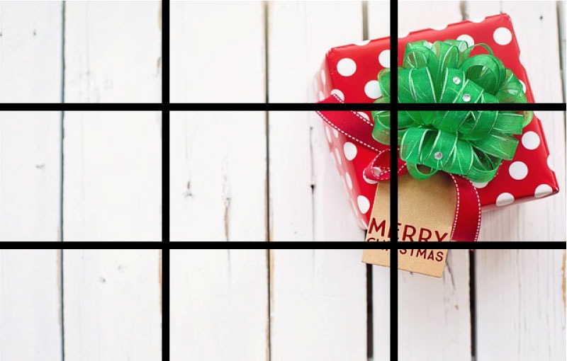
Take a look at the images below. Focal points (on the cross areas) make for great images.


It’s everywhere you look (at least everywhere that you are looking at something professionally produced. Take a look at the best music videos on YouTube. Every 3 seconds or less, the imagery changes, yet the rules are never broken – everything that makes the final cut is perfectly “thirded-out” (as we like to say).

The brain likes rule-of-thirds. Trust in it. When designing anything, make sure to incorporate this as a design “must”. Taking a picture, elements of a logo, product design, packaging design.
Golden Ratio
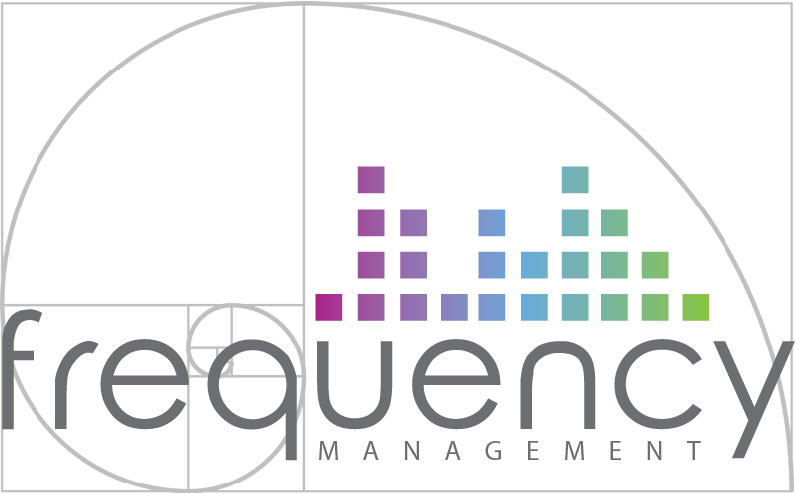
This one is kind of mind blowing, but mathematically sound. When we design logos, we make sure to utilize this rule, sometimes referring to it as God’s Rule.
 Think about this:
People thought the world was flat, until 1492, when they realized it wasn’t.
Psychology has only really been studied for around 150 years.
Psychology as a self-conscious field of experimental study began in 1879. Wilhelm Wundt, often regarded as the father of psychology, opened the world’s first laboratory dedicated to the study of psychology. The Institute for Experimental Psychology in Germany opened in 1879 at the University of Leipzig.
The beginning of modern psychology began in 1879. That means the study of psychology is less than 150 years old.
We don’t know what we don’t know yet. But, we do know some things about psychology in design.
Trust in these simple psychological design tips (over your gut if it’s breaking the rules). If you are ever in question, watch any professionally shot movie, music video, interview, magazine ad, or newscast. They are using it, so should you.
