Competition in the online business market is at an all-time high, and to increase business sales, you need to attract the right target audience and ensure that they are getting engaged with your brand. How would it be possible? You should focus on having a website with better user experience design aspects. The number of users coming to your website and how many conversions you could achieve will make you understand whether your website is alive or dead. Having a website will surely give you an online presence, but what if no one comes to your website? What if no one is interested in getting engaged with your business services, products, and content? If such situations continue to prolong, you will see that your business is losing out.
Conversion rates also indicate the level of your business. If the conversion rates are high, then your business is functioning well. If not, you will have to struggle hard to keep up with the rising competition. One of the best ways to get more conversion rates for your website is to have a better UX (User Experience) design. How? Read further to know more.
#1 UX Website Design Must Support Better Placement OF CTA (Call-To-Action):
You might be surprised to see this point as the very first one. But it is quite essential to understand that CTA plays a vital role in increasing the conversion rates. Just imagine if you are a user on an e-commerce website, and you are unable to track down the “Add to cart” or “Buy now” button easily, you would definitely leave the website. You should not make it tedious or difficult for users to search for the right options and buttons. A site where the CTA has tricky visibility and is hard to read will lose customers. To resolve this issue, the goal of UX website designers should be to place the CTA so that it is convenient to reach and quick to complete the required actions.
You should see to it that most of the CTA must lie above the fold of the website.
The website should have minimum scrolling
Have a responsive website that is perfectly visible on all types of screens.
When the CTAs are placed perfectly, it will be easy for you to direct your customers to the sales pages or product pages where they can buy the product and check out smoothly. For instance, if you are placing CTAs below the fold of the website, the number of users directed to the sales pages would be lower.
#2 Your Focus Should Be On Streamlining The Wide Range Of Processes On The Website: On a website, there are numerous processes that a user may experience. For instance, browsing products, adding them to wish lists, sharing blog content on social media, buying products, providing reviews/feedback, checkout process, etc. All these processes should be smooth and fast-paced. And for that, you need to ensure that each and every process is streamlined. When the processes available on the website are perfectly streamlined, it would be easy and convenient for the users to stay engaged for a longer period of time. Moreover, it will be fruitful for making the user experience great. By having a simplified and smooth process, you can attract a large number of users to the website, and also increase conversion rates.
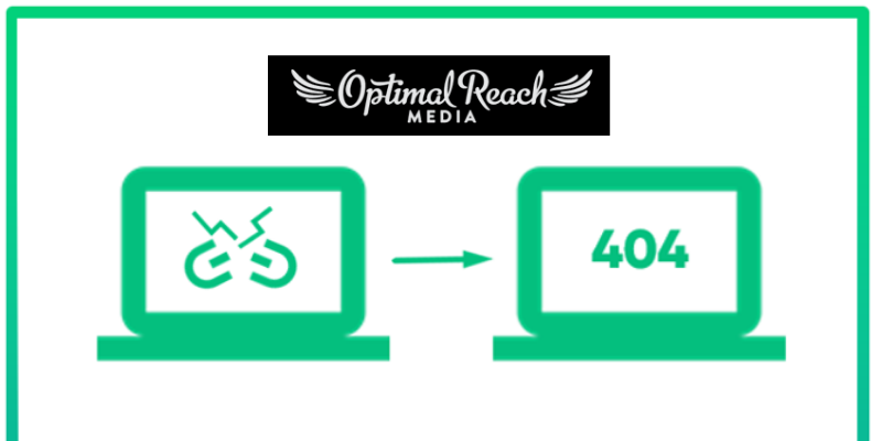
#3 There Should Be Minimum Or No Broken Links Present On The Website: This is one of the essential aspects of UX design — not to have broken links on the website. You won’t directly come to know that your website is having several broken links. So you need to make use of advanced tools that will help you in identifying the broken links, as well as in removing them from your website. If you are interested in improving the conversion numbers, you need to retain buyers, and so you should get rid of all the broken links or 404 errors as soon as possible.
Summary:
Having a beautiful website is not enough if you want your business to grow by increasing the number of sales. You should focus on improving the UX design and ensuring that the users are having a great experience on your website, and are engaging with your brand. You should follow the above-mentioned steps in order to improve the UX design of the website, which in turn will improve the conversion rates.


