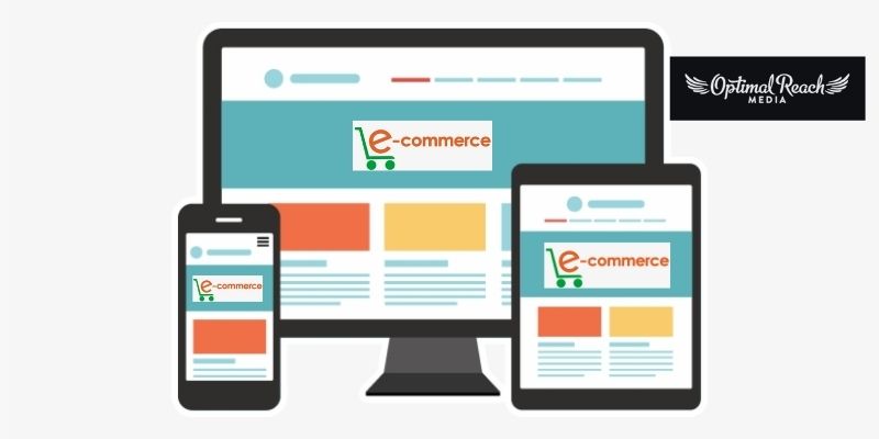
Online shopping has been on a steady rise and the pandemic has made it surge faster. In today’s time, online shopping is not only for ensuring safety but also for providing an enjoyable shopping experience from the comforts of our homes. Unlike earlier times, people are not afraid of making online purchases. Rather, they find it extremely convenient and easy to choose the best products, make online price comparisons and get the best deals. But for all this, a business should have a perfect e-commerce website. Having a powerful and dynamic website for your e-commerce business is not a luxury anymore. It has become a necessity. If you desire to build a strong online presence, grab the attention of your target audience, and ensure that your audience can easily visit your website. Then you must design the e-commerce website with dynamic features, attractive designs, and high-quality images. Moreover, the website should be supported not only on desktops but also on a wide range of smart devices, such as smartphones or tablets.
To make the e-commerce website powerful, you need to incorporate certain critical elements.
#1 Understand The Design Of The E-commerce Website:
You must be very clear as to how your website pages must appear. This includes the integration of the product images, description, prices, appearance of the home page, about us page, contact us, privacy page, terms and conditions, payment page, and various other important pages of the website. You must ensure that the design of the navigation field, the pagination, menus, etc are appropriate. When you have clarity of the website design, it would be easier for the users to move around the website with the same clarity.
#2 The E-commerce Website Must Have Proper Filters + Flexible Shopping Cart:
Providing users the flexibility to select or narrow down the search results is considered as one of the most crucial elements that a powerful eCommerce website must have. Your target audience will actually like to shop on your website when they get exactly what they are looking for. Filters play a vital role in achieving this. With the help of filters, users do not have to go through endless scrolling to reach the exact product they want or the type of product they are searching for. This helps in enhancing the user experience of the website and increasing the number of people who would love to visit your website again. An e-commerce website must have multiple filters so that it becomes easier to reach the desired product.
Besides this, the users must have the flexibility to add products to their shopping cart or the wishlist. This should be done with just one click. The users do not want to perform multiple steps merely to add a single product to the wishlist or the shopping cart.
#3 The E-Commerce Website Must Have A Responsive Design:
Your target audience will not just make use of a desktop for online shopping. Nowadays, users are more active and prefer to access sites from smartphones rather than desktops. So you must ensure that your e-commerce website has a powerful, responsive design and should provide a better user experience even on smartphones.
#4 E-commerce Websites Must Have Perfect Product Description (Images, Price, And Detailed Product Information):
The main purpose of the e-commerce website is to provide the best products to the users. So, the design of the WordPress website must be structured in such a way that it supports the accommodation of a large number of products along with proper images and product descriptions. You must provide multiple image sections (generally eight-image features are preferred) so that the user can scrutinize the product perfectly before making the purchase. Moreover, it is essential to provide minute details of the product as no customer would want to buy something without having proper information. This element is quite significant as it will improve the opportunity for better placement on the search engines.
#5 The Placement Of Call-To-Action:
Well, every e-commerce business owner is looking for increasing business sales. The best element that boosts sales on the e-commerce website is CTA — Call-To-Action. Call-To-Action can be buttons or links, and you need to place them strategically so that users are encouraged to buy the product, read about it, or add them to their cart or wishlist.
Summary:
Having an e-commerce website for boosting the sales of your business is quite essential. But just creating a website and hosting it is not enough. You need to make sure that all the critical elements of a website are present on your site. These are what make an e-commerce website powerful and dynamic.


